

RWU Athletics reveals new Hawk logo
For Roger Williams University, there’s a new hawk on the block. Well, hawk logo, that is.
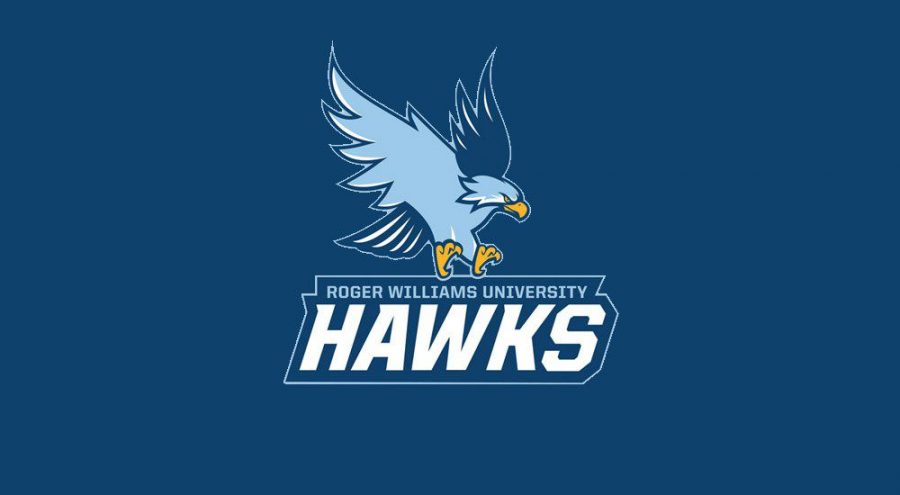
A university-wide email sent Thursday morning signed by RWU Director of Athletics, Intramurals and Recreation, Kiki Jacobs, announced that a new Hawk logo will debut this fall. The new logo’s navy and light blues highlighted with gold accents represents “a strong, unified identity for Athletics that is more cohesive with the overall University,” wrote Jacobs in the email. “The new Hawk is passionate, determined and fierce.”
A committee comprised of branding, marketing and graphic design professionals, including 2013 RWU graduate Blair Carroll, worked for several months on the project beginning in October 2017. The original plan was to only change the school colors, but the committee decided on a complete logo update.
“I felt it was important that our athletic colors match the school colors,” Jacobs told The Hawks’ Herald. “Athletics play a big role in the branding of a school. I felt we needed to be on the same page as the university as a whole to help promote RWU.”
Carroll, a graphic designer, contributed greatly to the project by designing the updated logo using input from coaches, student-athletes, and alumni.
The intent of the new logo is to create unity throughout the university which “will be powerful in strengthening Roger Williams’ brand identity and awareness,” wrote Jacobs.
According to Jacobs’ email, the new logo will begin to become apparent throughout the university in the fall, starting with signs and decals around the campus. Merchandise with the new logo will arrive in the bookstore this semester. In the athletic department, the website will adopt the new color palette and logo. Since the turf field was just replaced, the old logo will remain in the center of the surface, but the new logo will be slapped onto the gym floor when it is replaced during the summer of 2020. The athletic teams’ uniforms will follow the standard replacement schedule and all will have the updated logo by July 2020.
The new, more realistic hawk replaces a cartoon-like solid blue hawk. Jacobs, whose favorite detail of the logo is the realistic talons, wrote that the “combined strength of the consistent colors is apparent, eliminates confusion, and will help drive awareness of our programs.”