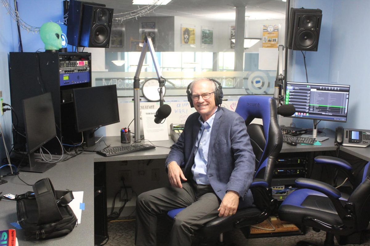
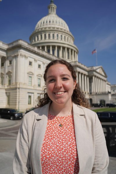
As the ongoing Roger Williams University branding initiative continues, Chief Marketing Officer, Laura Baldwin and Creative Director Blair Carroll gave an update on the process at the Student Senate Meeting on Mon., Feb. 26.
Baldwin and Carroll said the major questions they have been exploring in the branding process are, “How do we bring the institution together?” and, “Why institutional branding?”
They believe Institutional branding is important because it will create “consistency” in RWU’s identity and expand the reach of the university. Additionally, Carroll and Baldwin said institutional branding will improve RWU’s market position and align brand perceptions with the university community.
“We want Roger Williams to shine,” said Baldwin.
Currently, the process is in Phase 6 moving into Phase 7 – Applying and Building Identities. Baldwin and Carroll said their concepts have been testing well and are beginning to engage students in their research.
Through open houses and new visits, Baldwin and Carroll said bold colors were attracting students and having the mark of RWU be less of a seal and more of an actual logo were beneficial.
Additionally, throughout the branding process, the marketing team has created multiple different options, including an “R” which was not aligning with students and the RWU community.
Baldwin and Carroll found “RW” and “RWU” were resonating with the RWU community with bold colors better than the previous “R.” Further, 87% of the students surveyed preferred “RWU” logos on potential merchandise.
The branding team has also been attempting to further build the brand elements with color palette exploration. Color palette options included various combinations of navy blue, light blue, white, and gold. Baldwin and Carroll said 72% of people surveyed strongly agreed or somewhat agreed light blue, navy blue, and gold were the most authentic to RWU.
Other brand elements Baldwin and Carroll have been exploring are slogans and photography styles. For instance, they have been trying to pair aerial, “hawk’s eye view” photography with portraits.
The floor was later opened up to questions from the Student Senate and the Organization Leaders present.
Academic Affairs Chair, Matthew Tilly, asked how the logo resonates with newer students, and how it will impact enrollment.
Baldwin said the current RWU logo has the seal and the written word, making it resonate more with academics than athletics. Baldwin’s goal in making the logo was to make a “quick mark” for social media, billboards, quick advertising as well as make a difference between traditional university and brand awareness.
Baldwin and Carroll also said they work closely with admissions to understand how the logos are resonating with prospective and new students.
Another student, Jared Richardson, also asked how and if the branding process involves the Law School and other graduate programs offered at RWU.
Baldwin answered that the team is taking into account the various graduate programs, and that the Law School has also used the “R” in some of their recruitment materials. She also said they were asking questions as to how to effectively involve University College into the branding initiative.
Baldwin also said throughout the process, they were looking for a foundational aspect that can be applied across different areas of the university and that there is a need for consistency between the various schools.
“Branding is a process because you want to get it right, but you have so many groups you want it to resonate with,” said Baldwin.
Baldwin and Carroll said the timeline for the gradual phase in the new logo to the university by the start of the 2024-2025 academic year.
To fill out the survey, use this link to the survey

